1. System Requirements
-
Java SE 8 with bundled JavaFX 8
-
Maven 3.3
-
Environment variables:
-
JAVA_HOME: your JDK installation dir
-
M2_HOME: your Maven installation dir
-
M2: <M2_HOME>/bin
-
2. Tested environment
-
Tested Java version: 1.8.0_201; Java HotSpot™ 64-Bit Server VM 25.201-b09
-
Tested Maven version: 3.6.0
-
Tested OS: Kubuntu 18.04.2 LTS; Linux version 4.15.0-70-generic running on amd64; UTF-8; de_CH (nb)
3. Drombler FX Sample Application - generate, build and run
In this trail we’ll generate a Drombler FX sample application, build and run it in 3 simple steps.
3.1. Create the Application
Drombler FX provides a Maven Archetype to create a simple Drombler FX-based sample application:
mvn archetype:generate -DarchetypeGroupId=org.drombler.fx -DarchetypeArtifactId=drombler-fx-maven-archetype-application -DarchetypeVersion=1.0 -DgroupId=com.mycompany.test -DartifactId=test -Dversion=0.1-SNAPSHOT -DbrandingId=my-applicationNote: You can replace groupId, artifactId, version and brandingId as you see fit, of course. But for the rest of this section we assume the values as shown above.
3.2. Build the Application
cd test
mvn clean install
3.3. Run the Application
To run the application from the command line, you can use either:
cd test-application
java -Duser.language=en -Duser.country=US -Djavafx.verbose=true -Dbinary.css=false -Djava.util.logging.config.file=target/deployment/standalone/conf/logging.properties -jar target/deployment/standalone/bin/my-application.jar --userdir target/userdir
or:
cd test-application
mvn exec:exec
or you can just double-click the my-application.jar in the target/deployment/standalone/bin directory.
The --userdir option is quite useful during development. If you omit it, the default location will be used: ${user.home}/.${brandingId}/${project.version}
4. Drombler FX Sample Application - the running application explained
This sample application uses the Standard Desktop Classic Layout.
When you start-up the application you should see something like the following:
-
A JavaFX window with a custom title
-
A content pane consisting of four Views (Left, Right, Top and Bottom) around an empty editor area
-
A Menu Bar with the following Menus: File, View, Custom, Window and Help
-
A Toolbar Container with three Toolbars: File, Rectangle and Circle
-
A Status Bar, which shows a progress monitor if there is any worker in the application wide context
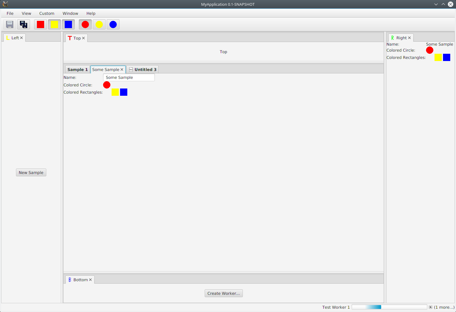
Let’s start with the Content Pane.
4.1. The Content Pane
What you actually can find here is an initial version of a Docking Framework: The Docking Framework splits up the content area into any number of Docking Areas. Drombler FX provides 5 Docking Areas out-of-the-box: left, right, top, bottom and editor. The Docking Areas can be resized using the dividers. Each Docking Area can hold any number of Dockable Panes, which are layed out as Tabs. The left, right, top and bottom areas have been configured only to be visible if they contain any docked Dockable Pane. The editor area has been configured to be always visible.
The Left Dockable Pane has been provided by the sample and is docked to the left Docking Area. It contains a button to create a new Sample object and open a Sample Editor Dockable Pane in the editor Docking Area.
The Sample Editor (opened if you click on the "New Sample" button in the Left Dockable Pane) is provided by the sample and contains a text field, which is bound to the Tab text of the Sample Editor, and displays the currently selected circle and rectangles.
The Foo Editor (opened if you click on the "File → New" menu item or open a foo file with "File → Open" or by passing a foo file path as argument at application start) is provided by the sample and contains a text area to display the text content of the foo file.
The Right Dockable Pane, provided by this sample project and docked to the right Docking Area, shows the information of the currently selected sample.
The Bottom Dockable Pane, provided by this sample project and docked to the bottom Docking Area, provides a button which creates background tasks and shows how to display them in the Progress Monitor.
The sample also provides a Top Dockable Pane, which is docked to the top_Docking Area_ and contains a Label showing Top respectivly. This Dockable Pane is provided to make the corresponding Docking Area visible.
See Docking Framework for more information about the Docking Framework.
Let’s continue with the Toolbars.
4.2. The Toolbars
Above the Content Pane you can find a Toolbar Container, which can contain any number of Toolbars. Currently three types of Toolbar buttons are supported: "normal" Toolbar buttons, toggle Toolbar buttons without a ToggleGroup and toggle Toolbar buttons within a ToggleGroup. The Toolbar Container is provided by Drombler FX.
An Action Framework keeps the state (enabled/ disabled, selected/ unselected etc.), the information (texts, image etc.) and the logic between Menu items and Toolbar buttons in sync.
Actions may be always enabled or only under certain conditions.
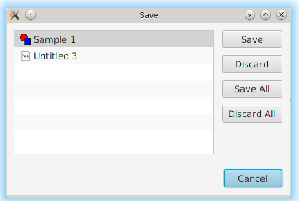
The File Toolbar is a standard Toolbar and the "Save" and "Save All" Toolbar buttons are standard Toolbar buttons provided by Drombler FX. The "Save" Toolbar button is only enabled if the currently selected Dockable Pane contains something to save. The "Save All" Toolbar button is only enabled if any Dockable Pane contains something to save. E.g. the sample editor and the foo editor are marked as modified by default. You can see this as the save actions are enabled and the text of the tab is in bold. If you save an Editor the "Save" button becomes disabled and the text of the tab is back to normal again. If you click on another modified Dockable Pane the "Save" button gets enabled again. The "Save All" button, however, stays enabled as long as there is still a modified Dockable Pane open. Once a new sample gets saved, the name text field is not editable anymore. For every saved Editor there is also a configured tooltip of the tab: for sample editors it’s simply the name and for foo Editors it’s the file path. If you close an unsaved Editor or if you close the window/ application while there are still unsaved Editors open, the Docking Framework detects this and provides an according dialog.
The Rectangle Toolbar, provided by the sample project, provides three toggle Toolbar buttons with colored rectanlge images. Since they don’t belong to a toggle group any number of them may be selected. They are only enabled if the currently selected Dockable Pane can manage colored rectangles - such as the Sample Editor.
The Circle Toolbar, also provided by the sample project, provides three toggle Toolbar buttons with colored circle images. Since they belong to a toggle group only one can be selected at a time. They are only enabled if the currently selected Dockable Pane can manage a colored circle - such as the Sample Editor.
Note that the selection of the toggle buttons is context sensitve as well. E.g. if you have two open Sample Editors you can have different selections for each of these editors. The buttons reflect the selection depending on the currently active Sample Editor. When you select a Dockable Pane, which cannot manage colored circle/ rectangles, the corresponding buttons become unselected and disabled again.
Note that the Toolbar buttons have been configured with Tooltips (only visible if they are enabled).
Note: If you run the application with a German locale the texts provided by Drombler FX are shown in German.
See Actions, Menus and Toolbars for more information about Actions and Toolbars.
Let’s continue with the Menus.
4.3. The Menus
At the top there is a Menu Bar provided by Drombler FX.
An Action Framework keeps the state (enabled/ disabled, selected/ unselected etc.), the information (texts, image etc.) and the logic between Menu items and Toolbar buttons in sync.
The File menu, which is a standard menu provided by Drombler FX, contains
-
A New menu item, which opens a new "foo" document in an Editor. This custom menu item is provided by the sample.
-
3 test menu items ("Test 1", "Test 2" and "Test 3), which simply write some text to the standard output. These are custom menu items provided by this sample.
-
A Open menu item, which provides a generic open file dialog and supports "foo" files. This is a standard menu item provided by Drombler FX.
-
2 Save menu items ("Save" and "Save All"). These are standard menu items provided by Drombler FX. They behave in the same way as the corresponding Toolbar buttons described above.
-
An Exit menu item, which properly shuts down the JavaFX Platform and the OSGi Platform. This is a standard menu item provided by Drombler FX
-
Some separators between some of the menu items.
The View menu contains a Toolbars menu, with a toggable menu item for each registered Toolbar. Here you can select which Toolbars should be visible. This is a standard feature of Drombler FX.
The Custom menu and its contents is provided by the sample. You can register any number of menu items and (possibly deeply nested) sub-menus. The Custom menu contains 3 rectangle actions and the Sub Menu contains 3 circle actions. They behave in the same way as the corresponding Toolbar buttons.
The Window menu contains a menu item for each registered View to open them again. (Views are treated as Singletons - there is only one instance per View type.) The View menu items can also be registered in some sub-menus. Here: the Right View is registered in the Others sub-menu. This is a standard feature provided by Drombler FX. See the Content Pane section above for more information about the Docking Framework.
You could try and close one of the sample Views: Left, Right, Top or Bottom. Note that as they are closed the space of their parent Docking Area is given to the other Docking Areas. If you click on the corresponding Window menu item the corresponding Docking Area will get some space again and the View is opened in that Docking Area.
The Help menu is also a standard menu provided by Drombler FX, but it is currently empty.
Note that most menu items have been configured with accelerator and mnemonic keys.
Note: If you run the application with a German locale the texts provided by Drombler FX are shown in German.
See Actions, Menus and Toolbars for more information about Actions and Menus.
4.4. The Status Bar
The Status Bar can be used to display some additional information to the user such as the current running, but cancelable background workers.
See Status Bar for more information about the Status Bar.
See Progress Monitor for more information about the Progress Monitor.
5. Drombler FX Sample Application - the binaries explained
Let’s have a look at the generated binaries.
You can find the binaries in the target directory of the test-application project at: deployment/standalone
In the bin directory you can find the executable main JAR: my-application.jar
The JAR has been branded using the specified brandingId.
Let’s have a look at the content of this JAR.
You can find:
-
META-INF/MANIFEST.MF: a Manifest file with the Main-Class header and the Class-Path header, which turns this main JAR into an executable JAR.
-
applicationConfig.properties: contains application configurations such as: title, width and height
In the lib directory you can find the JARs needed at start-up time to start a Drombler FX application:
-
the drombler-fx-startup-main JAR: it contains the JavaFX application main class and defines the org.osgi.framework.system.packages.extra property to make the JavaFX packages and the Drombler start-up packages available to the OSGi bundles.
-
the drombler-acp-startup-main JAR: it contains the GUI-toolkit agnostic start-up classes.
-
the org.apache.felix.framework JAR: the Apache Felix Framework, an implementation of the OSGi runtime framework.
In the bundle directory you can find all direct and transitive Maven dependencies with scope compile or test. The start-up classes will load these bundles.
The conf directory contains the files copied from /src/main/app. The Drombler FX Maven Plugin makes sure the property files for
application and system properties exist and contain the necessary properties such as the default location of the user directory.
The user may change their values here.
6. Drombler FX Sample Application - the source code explained
You should see now a directory "test", with the following content:
-
pom.xml
-
test-application
-
test-foo
-
test-parent
-
test-sample
These are in fact 5 Maven projects. Let’s have a look at them one by one.
6.1. The Multi-Module Project
The top-level project (the pom.xml in the test-directory) is a multi-module project. It’s used to build all parts of your application with a single "mvn clean install".
6.2. The Drombler FX Application Project
The project in the test-application directory is the Drombler FX Application project. Its Maven packaging type is "drombler-fx-application" and thus requires the Drombler FX Maven Plugin "org.drombler.fx:drombler-fx-maven-plugin" as an extension.
This project is used to:
-
configure the bundles your application is made of
-
provide additional resources
-
deploy them
-
run the application
In the Drombler FX Maven Plugin configuration you can specify the brandingId and the application title, width and height.
| Currently you always need to rebuild this project if any of its bundles has changed! |
The nbactions.xml enables the "Run Project" and "Debug Project" buttons in NetBeans for this project. You can have a look at it to see how to run and debug the application. You can delete this file if you use another IDE than NetBeans.
6.3. The Foo Project
It shows how to register support for "foo" files.
The foo project is a standard OSGi project. You can use org.apache.felix:maven-bundle-plugin as an extension plugin and the packaging type "bundle" to let Maven generate the OSGi Manifest entries for you (using a POM first approach).
The FooHandler is registered as a Document Handler for the MIME type "text/x-foo+xml". It knows how to load and write the content of "foo" files.
The package-info provides a file extension registration which associates the "foo" file extension with the "text/x-foo+xml" MIME type.
The FooEditorPane implements a Dockable Pane which gets registered as an Editor for FooHandler. This sample code provides a simple TextArea to edit the text of the foo files.
The NewAction implements an action which creates a new FooHandler and opens an Editor for this FooHandler.
6.4. The Parent Project
The parent project contains the parent POM used by the other projects of this sample.
Have a look at the comments in the POM for more information.
| I prefer to have the parent POM (used to inherit configurations) and the multi-module POM (used for reactor builds) in two separate POMs. If you prefer to use the multi-module POM as the parent POM, feel free to copy the content of the parent POM to the multi-module POM and to delete this parent POM. |
6.5. The Sample Project
This is the project which provides the actual sample specific parts.
The sample project is a standard OSGi project. You can use org.apache.felix:maven-bundle-plugin as an extension plugin and the packaging type "bundle" to let Maven generate the OSGi Manifest entries for you (using a POM first approach).
Since part of modular programming is about keeping APIs private and not exporting them, it’s a good practice to start adding classes to a private package such as: *.impl.\* (the org.apache.felix:maven-bundle-plugin takes care that such packages stay private by default.) Only classes which should be accessible by other bundles should be in exported packages.
So most classes are in the package: com.mycompany.test.sample.impl
In this package you can find the abstract toggle action classes AbstractColoredCircleAction and AbstractColoredRectangleAction, both implementing the interface ActiveContextSensitive to set their state depending on the content of the active Context.
As you can see they are looking for instances of the interface ColoredCircleManager/ ColoredRectangleManager in the active context. They register a listener to get notified whenever the content of the active context changes. When the selection state of the toggle action changes, they call the corresponding methods of ColoredCircleManager/ ColoredRectangleManager. This is the mechanism to loosly couple Actions to other parts of the application: At one end a DockingPane in one bundle adds an instance of the required interface to its local context. The Action at the other end (and possibly in a different bundle) looks for instances of this interface in e.g. the active context.
The BlueCircleAction, RedCircleAction and YellowCircleAction use annotations to register the toggle actions, the toggle menu entries and the toggle toolbar entries. Note that the toggle menu entries and the toggle toolbar entries specify the same toggleGroupId, which has the effect that only one of them can be selected at a time.
The BlueRectangleAction, RedRectangleAction and YellowRectangleAction also use annotations to register the toggle actions, the toggle menu entries and the toggle toolbar entries. Note that they don’t specify a toggleGroupId, however, allowing them to be selected at the same time.
The actions Test1, Test2 and Test3 show 3 different ways to implement "normal" (non-toggle) actions.
The package-info uses some annotations to register additional menus and toolbars.
See Actions, Menus and Toolbars for more information about Actions, Menus and Toolbars.
The LeftTestPane is a Dockable Pane using annotations to register itself as a view in the left Docking Area and a corresponding menu item in the Window menu. The onNewSampleAction logic, which gets triggered when the "New Sample" button gets clicked, creates a new Sample and opens it in a new SampleEditorPane.
The SampleEditorPane is a Dockable Pane using annotations to register itself as an Editor. It configures a writable local context and adds to it an instance of a custom implementation of ColoredCircleManager and ColoredRectangleManager to enable the colored circle and colored rectangle toolbar buttons and menu items. The SampleHandler instance gets automatically added to its implicit local context, so that other Dockable Panes can look for it and display some information about it.
It configures the controls from the values of the properties of the Sample.
Whenever the content of the SampleEditorPane changes the method markModified() gets called to add an instance of a Sample specific implementation of the Save interface to its local context to enable the "Save" and "Save All" Actions. If one of the Save toolbar buttons or menu items get clicked, the method save() of the private class SampleSavable gets called. It updates the Sample properties and removes itself from the local context to disable the Save actions. A real application would probably also call some methods here to make the changes persistent. Note: Since this SampleEditorPane updates the properties of the sample only when the sample gets saved, other Dockable Panes such as RightTestPane are only updated once one of the Save toolbar buttons or menu items gets clicked!
The RightTestPane is a Dockable Pane using annotations to register itself as a view in the right Docking Area and a corresponding menu item in the Window/Other sub-menu. It implements ActiveContextSensitive to look for a Sample instance in the active context. If it finds one, it shows the properties of the sample. Note that it also configures a writable local context and adds the found SampleHandler object to it. This has the effect that you can click on the RightTestPane and it continues to display the properties of the SampleHandler.
The TopTestPane and the BottomTestPane are Dockable Panes using annotations to register themselves as a view in the top/ bottom Docking Area and a corresponding menu item in the Window menu.
The DockingPanes look for a FXML file with the same name in the same package, e.g. LeftTestPane looks for LeftTestPane.fxml. This is a convention of Drombler FX. (The FXML files are in the resource directory.)
Note that the classes ColoredCircle, ColoredCircleManager, ColoredRectangle and ColoredRectangleManager are in the package com.mycompany.test.sample, which is an exported package (have a look at the generated Manifest file). This means that other bundles can use these classes to interact with the colored circle and rectangle actions, toolbar buttons and menu items. The same is true for the Sample and the SampleHandler classes: since they are in the exported package, Views in other bundles can look for them in e.g. the active context.
See Docking Framework for more information about the Docking Framework.
See Context Framework for more information about the Context Framework.
The localized texts are expected to be specified in the Bundle.properties file (or a locale specific derivation of this file) in the same package as the annotated class in question. This is a convention of Drombler FX.
See Localization for more information about localizing Drombler FX applications.