This section describes an initial version of a Docking Framework.
1. Activation
To activate the Docking Framework in your application add the following runtime dependency:
<dependency>
    <!--  Provides JavaFX based implementations of the Docking Framework
          You could omit this dependency as long as it is a transitive dependency. -->
    <groupId>org.drombler.fx</groupId>
    <artifactId>drombler-fx-core-docking</artifactId>
    <scope>runtime</scope>
</dependency>|
This dependency will provide an implementation of the ApplicationContentProvider service interface. So in addition to this dependency you need an Application Layout, which supports the ApplicationContentProvider service interface such as the Standard Desktop Classic Layout. |
|
The Docking Framework also provides an implementation of the OnExitRequestHandlerProvider service interface, which helps prevent loosing any unsaved data. |
2. Docking Areas
The Docking Framework splits up the content area into any number of Docking Areas. The Docking Areas can be resized using the dividers. Each Docking Area can hold any number of Dockable Panes, which are layed out as Tabs.
2.1. Registering Docking Areas
Docking Areas can be registered using the @DockingArea and @LayoutConstraints annotations on a package (usually in package-info.java):
@DockingArea(id = "myEditorArea", kind = DockingAreaKind.EDITOR, position = 25,
        path = {20, 40, 50}, permanent = true)
@DockingArea(id = "myUpperViewArea", kind = DockingAreaKind.VIEW, position = 40,
        path = {20, 40, 20}, layoutConstraints = @LayoutConstraints(prefHeight = 50))
@DockingArea(id = "myLeftViewArea", kind = DockingAreaKind.VIEW, position = 10,
        path = {20, 20}, layoutConstraints = @LayoutConstraints(prefWidth = 200))
package tutorial.docking;

import org.drombler.acp.core.docking.DockingArea;
import org.drombler.acp.core.docking.LayoutConstraints;
import org.drombler.commons.docking.DockingAreaKind;
The @DockingArea properties:
| Property | Value |
|---|---|
id |
the ID of the Docking Area. This ID can be used when registering Dockable Panes (see further down) |
kind |
the kind of the Docking Area. |
position |
the position in the parent split pane. It’s a best practice to leave out some positions between entries to allow other bundles to register entries between some existing ones. |
path |
the path positions of the parent split pane. It’s a best practice to leave out some path positions between entries to allow other bundles to register entries between some existing ones. |
permanent |
if true, visible also when empty, else only visible if not empty |
layoutConstraints |
the layout constraints (see further down) |
The @LayoutConstraints properties:
| Property | Value |
|---|---|
prefWidth |
the preferred width of the Docking Area. Can be negative to indicate a flexible width (default). |
prefHeight |
the preferred height of the Docking Area. Can be negative to indicate a flexible height (default). |
The next section covers these properties in further detail explaining the standard Docking Areas provided by Drombler FX.
2.2. Standard Docking Areas provided by Drombler FX
Drombler FX provides 5 Docking Areas out-of-the-box: left, right, top, bottom and editor. The left, right, top and bottom areas have been configured to be visible only if they contain any docked Dockable Pane. They have been configured as VIEW Docking Areas and thus are intended for view Dockables. The editor area has been configured to be always visible, even if it’s empty. It has been configured as EDITOR Docking Area and is thus the default Docking Area for editor Dockables.
@DockingArea(id = "editor", kind = DockingAreaKind.EDITOR, position = 20,
        path = {20, 40, 50}, permanent = true)
@DockingArea(id = "top", kind = DockingAreaKind.VIEW, position = 20,
        path = {20, 40, 20}, layoutConstraints = @LayoutConstraints(prefHeight = 100))
@DockingArea(id = "bottom", kind = DockingAreaKind.VIEW, position = 20,
        path = {20, 40, 80}, layoutConstraints = @LayoutConstraints(prefHeight = 100))
@DockingArea(id = "left", kind = DockingAreaKind.VIEW, position = 20,
        path = {20, 20}, layoutConstraints = @LayoutConstraints(prefWidth = 200))
@DockingArea(id = "right", kind = DockingAreaKind.VIEW, position = 20,
        path = {20, 80}, layoutConstraints = @LayoutConstraints(prefWidth = 200))
package org.drombler.acp.core.standard.docking.impl;

import org.drombler.acp.core.docking.DockingArea;
import org.drombler.acp.core.docking.LayoutConstraints;
import org.drombler.commons.docking.DockingAreaKind;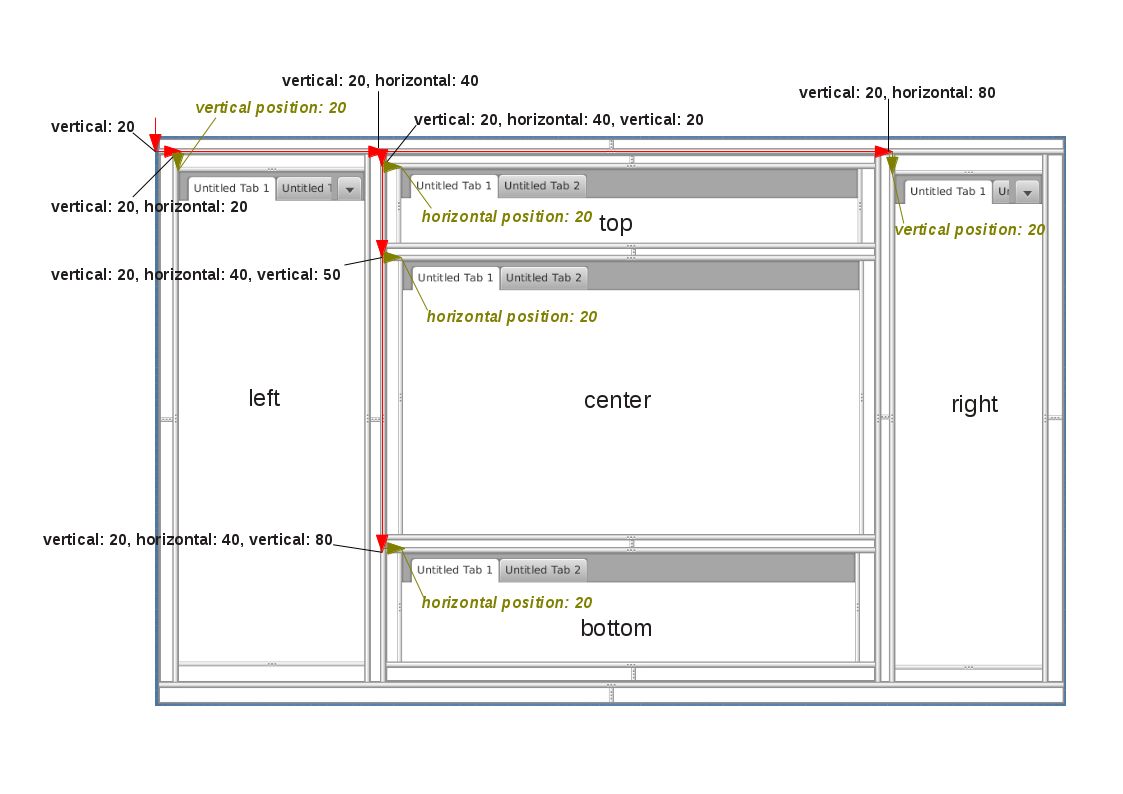
As the image illustrates e.g. for the Docking Area "right", the path {20, 80} and position 20 are interpreted as:
-
The parent of the Docking Area is located at:
-
Start with a vertically splitted pane.
-
At path position 20 of this vertically splitted pane, add a horizontally splitted pane
-
At path position 80 of this horizontally splitted pane, add a vertically splitted pane (= parent of the Docking Area, as the end of the path {20, 80} has been reached)
-
→ an even number of path positions creates a vertically splitted pane, an odd number of path positions creates a horizontally splitted pane
-
The Docking Area "right" itself is then added to this parent vertically splitted pane at position 20.
Note: To use the standard Docking Areas provided by Drombler FX, you need to add a runtime dependency (usually in your drombler-fx-application project) to: org.drombler.acp:drombler-acp-core-standard-docking
3. Dockable Panes
In Drombler FX applications you don’t design the whole application window, as this is managed by Drombler FX. Instead you design Dockable Panes, which are docked as tabs to Docking Areas.
Dockable Panes can extend from any Node such as layout panes.
Currently, there are 2 kinds of Dockable Panes: views and editors.
3.1. View Dockable Panes
View Dockable Panes are typically used to show or select some data.
Views are singletons: only one instance per type is used in the application.
Drombler FX provides a "Window" menu and requires each view to register a menu item, which can be used to open the view. The menu item implementation is provided by Drombler FX.
Drombler FX also provides the "Window" sub-menu "Other" out-of-the-box.
A Dockable Pane can be registered as a view using the @ViewDocking and @WindowMenuEntry annotations:
import org.drombler.acp.core.docking.DockingState;
import org.drombler.acp.core.docking.ViewDocking;
import org.drombler.acp.core.docking.WindowMenuEntry;

@ViewDocking(areaId = "left", position = 50, displayName = "%MyViewPane.displayName",
        accelerator = "Shortcut+4", icon = "myViewPane.png", state = DockingState.DOCKED,
        menuEntry = @WindowMenuEntry(path = "", position = 30))
@ViewDocking has the following properties:
| Property | Value |
|---|---|
areaId |
the ID of the Dockable Area this Dockable Pane should be registered to (see above for further information) |
position |
the (tab) position in the parent Dockable Area. It’s a best practice to leave out some positions between entries to allow other bundles to register entries between some existing ones. |
displayName |
the text to be used as the title of the Dockable Pane and as the text of the registered menu item. If the value starts with '%' the rest of the value is interpreted as a property key and the value gets looked-up in the Bundle.properties file (or a locale specific derivation of this file), which has to be in the same package as the annotated action. Note: Maven expects resources to be in the resources directory. |
accelerator |
the accelerator to open this Dockable Pane |
icon |
the icon to be used for this Dockable Pane. Note that this only specifies the name pattern. Drombler FX looks for <icon-base-name>16.<icon-extension> for menu items (expected to be 16x16 pixels). In the example above Drombler FX would look for myViewPane16.png. Note: Maven expects resources to be in a resources directory. If you’re using drombler-fx-parent as your parent POM, it’s best to put binary files under the resources-bin directory as this directory has been configured not to be filtered for variables. |
state |
the initial docking state of this Dockable Pane. (This has currently no effect.) |
menuEntry |
the menu item registration. (See further down for more information.) |
@WindowMenuEntry has the following properties:
| Property | Value |
|---|---|
path |
The menu path relative to the Windows menu. See Actions, Menus and Toolbars for more information about menus. |
position |
The position of the menu item in its parent menu. |
3.2. Editor Dockable Panes
Editor Dockable Panes are typically used to edit some data, e.g. in a form or a text editor.
To open an editor for a Data Handler call Dockables.openEditorForContent.
A Dockable Pane can be registered as an editor using the @EditorDocking annotation:
import org.drombler.acp.core.docking.EditorDocking;

@EditorDocking(contentType = FooHandler.class)
public class DockableEditor extends GridPane {
@EditorDocking has the following properties:
| Property | Value |
|---|---|
contentType |
the data handler class |
3.3. Data Support
The Docking Framework registers an implementation of DataCapabilityProvider for the Openable Data Capability. It tries to open an Editor for a Data Handler by calling Dockables.openEditorForContent.
3.4. Samples
3.4.1. View Sample
The sample code below shows a simple implementation of a Dockable Pane registered as a view:
import java.io.IOException;
import javafx.event.ActionEvent;
import javafx.fxml.FXML;
import javafx.scene.image.ImageView;
import javafx.scene.layout.GridPane;
import org.drombler.acp.core.docking.ViewDocking;
import org.drombler.acp.core.docking.WindowMenuEntry;
import org.drombler.commons.fx.fxml.FXMLLoaders;

@ViewDocking(areaId = "left", position = 50, displayName = "%MyViewPane.displayName",
        menuEntry = @WindowMenuEntry(path = "", position = 30))
public class MyViewPane extends GridPane {

    @FXML
    private ImageView someImageView;

    public MyViewPane() throws IOException {
        load();
    }

    private void load() throws IOException {
        FXMLLoaders.loadRoot(this);
    }

    @FXML
    private void onSomeAction(ActionEvent event) throws IOException {
        // do something
    }
}
Note: The @ViewDocking doesn’t specify any values for accelerator or icon here as they are optional.
The easiest way to load a FXML file is to use the Drombler Commons utility method FXMLLoaders.loadRoot(this). It expects an FXML and a ResourceBundle file with the same name as the Dockable Pane (here: MyViewPane.fxml and MyViewPane.properties) in the same package. It registers the Dockable Pane as root and as controller.
Since the Dockable Pane gets registered as the controller, you can use the JavaFX @FXML annotation to inject controls and register method-callbacks.
Since the Dockable Pane gets registered as the root, the FXML is expected to start with "fx:root" and the type should be the parent type (here: "GridPane"):
<?xml version="1.0" encoding="UTF-8"?>

<?import java.lang.*?>
<?import javafx.scene.*?>
<?import javafx.scene.control.*?>
<?import javafx.scene.layout.*?>
<?import javafx.scene.image.*?>

<fx:root type="GridPane" xmlns:fx="http://javafx.com/fxml">
    <ImageView GridPane.rowIndex="0" GridPane.columnIndex="0" fx:id="someImageView" />
    <Button GridPane.rowIndex="1" GridPane.columnIndex="0"
            text="%MyViewPane.SomeButton.text" onAction="#onSomeAction"/>
</fx:root>
See Localization for more information about localization.
Note: Maven expects resources such as properties-files and FXML-files to be in the resources directory.
3.4.2. More Samples
For more samples have a look at Getting Started.